A wedding monogram is your two first initials around the initial of your last name. Type yours below, pick one of five layouts, then print it or download it. Everything stays in your browser. The classic version sets the last initial larger in the middle. Sources disagree on which first initial goes left, so there is a swap button.
Make your monogram
M R J · REYES
Your letters are saved in the link after the hash mark, so the page you share reopens your layout. That part of a link never goes to our server, and we do not have one that stores it. The link also carries your last name, so skip the copy-link button if you would rather not send it.
Layout gallery of five monogram arrangements
Pick a layout to see it with the sample couple, Maya and Jordan Reyes. Once you type your own letters above, the gallery redraws with them.
Which arrangement?
Classic trio. Maya on the left, Jordan on the right, and the last initial R standing larger between them. It is the layout most people picture, and it reads from across a room.
Circle. The same three letters inside a double ring. It suits round stickers, cup lids, wax seals and cookie tops, because the shape does the framing for you.
Stacked. The two first initials sit one above the other with an ampersand between them. The last initial stands alone on the right. It fits tall shapes like programs and menu cards.
Ampersand. Two first initials joined by an ampersand, with the full last name underneath. Pick it when you do not share a last name, or when you want the name spelled out.
Name banner. First initials small on top, the last name large, a thin rule above and below. It works as a sign header or a door hanger, where people read words faster than letters.
Table: the five layouts compared, with what each one shows (our judgment, not a measurement)
| Layout | Letters shown | Best on | Skip it when |
|---|---|---|---|
| Classic trio | Two first initials and the last initial | Invitations, napkins, signs | You want your full last name visible |
| Circle | Same three letters in a ring | Stickers, cup lids, seals | The item is wide and flat, like a banner |
| Stacked | Two first initials and the last initial | Programs, menu cards, tall signs | You need it very small, since three stacked shapes crowd |
| Ampersand | Two first initials and the full last name | Different last names, thank-you cards | You want one tight mark for a stamp |
| Name banner | Small initials and the full last name | Door signs, welcome signs, headers | The space is square and small |
How to order the initials
Etiquette sources agree on one thing. In a three-letter monogram the last-name initial goes in the center and is larger. They split on the sides. Some put the first initial of the bride on the left. Others put the groom’s first initial there, because his first and last initials used to stay together. Several call either order acceptable.
You are not bound by either. Pick one rule and use it on every item. Mixed order across the invitation, the napkins and the sign is what guests actually notice.
Example: three couples, one rule each
Table: initials order for three sample couples under our alphabetical-by-first-name rule (example, assumptions below)
| Couple | Last name used | Classic trio reads |
|---|---|---|
| Maya Torres and Jordan Reyes | Reyes | J R M |
| Priya Nair and Sam Nair | Nair | P N S |
| Alex Kim and Chris Dalton | Two last names | A & C, with Kim and Dalton underneath |
Assumptions: we sort by first name because it needs no one to decide who goes first. Couples with two last names skip the center letter, since a single center initial would pick one name over the other. The sample above in the maker shows Maya on the left, which is the other common order.
If your three letters spell something you did not mean, change the order. A couple with the initials of a rude word on every napkin finds out at the reception.
Where a monogram earns its place
A monogram is a logo for the day. It works when it repeats, so guests see the same mark on the paper, the table and the dance floor. Spend your effort on the places people look at longest.
- Invitation suite: top of the invitation, RSVP card and envelope flap. Match it to the colors you chose on the wedding color palette page so the paper looks like one set.
- Table and welcome signs: a banner layout reads best here. It sits well beside a seating chart sign or a guest schedule sign.
- Napkins, cups and stir sticks: use the circle or classic layout in one ink. Details get lost on small items.
- Cake and favors: a flat sticker or a stamped tag beats printing a fine design on icing.
- Dance floor: a decal needs a bold layout, so choose classic and skip the thin rings.
- Website and hashtag sign: the same mark next to your wedding hashtag ties the online and printed pieces together.
Mistakes that show up on the proof
- Hairlines that vanish. Thin rules and rings disappear on stamps, embossing and cheap napkin printing. Fix: choose classic or banner, or ask the printer to thicken the lines.
- A center letter the same size as the sides. Then it reads as three equal letters, and the last initial loses its place. Fix: keep the center clearly larger, as our layouts do.
- A different order on each item. Fix: write your rule in your planning checklist and send it to every vendor.
- Color only. A design that needs two inks costs more on napkins and fails on a photocopy. Fix: print a black-only copy before you approve it.
- Ordering before anyone sees a proof. Fix: ask for a digital proof and a sample, and put the monogram line in your wedding budget before you say yes.
Example: how our drawings scale
Our classic and circle layouts draw the center initial at 130 and 104 units against side letters of 70 and 56 units. Both ratios come out near 1.9. On a napkin stamp with 0.5 inch side letters, that puts the center letter near 0.9 inch. This is an example of our own proportions, not a rule from a source.
Table: banner type size for different last-name lengths on our 300-unit-wide card (example, computed by this page)
| Letters in the last name | Banner type size in units |
|---|---|
| 5 | 66 |
| 8 | 43 |
| 10 | 34 |
| 14 | 24 |
Assumption: the banner shrinks the name to fit 270 units of width, capped at 66 units. A long last name still fits, but it is smaller than a short one, so check it at the size you will print.
Check the monogram before you order anything
- Print the card at actual size and hold it at arm’s length. If you cannot read it, the details are too fine.
- Print it in black only. Keep the version that still looks right.
- Shrink it to napkin size on screen, or squint. The shape should survive.
- Read each letter alone. Make sure an R does not look like a K in your final font.
- Send the link to your partner or maid of honor and ask which layout they like.
- Ask your printer for a proof, and tell them your order rule.
Names that break the pattern
Table: what to try when the usual three-letter setup does not fit (our suggestions)
| Situation | What to try | Layout |
|---|---|---|
| Two different last names | Drop the center letter and show both names | Ampersand |
| Hyphenated last name | Use the first part as the center letter, or show the full name | Name banner |
| One partner keeps their name | Two initials only, or show both last names | Ampersand |
| Same-sex couple | Use the alphabetical rule or agree an order together | Classic trio |
| Long last name | Let the name carry the design instead of one letter | Name banner |
The maker takes the first letter of the last name for the center, so for a hyphenated name, type the part you want in the center first.
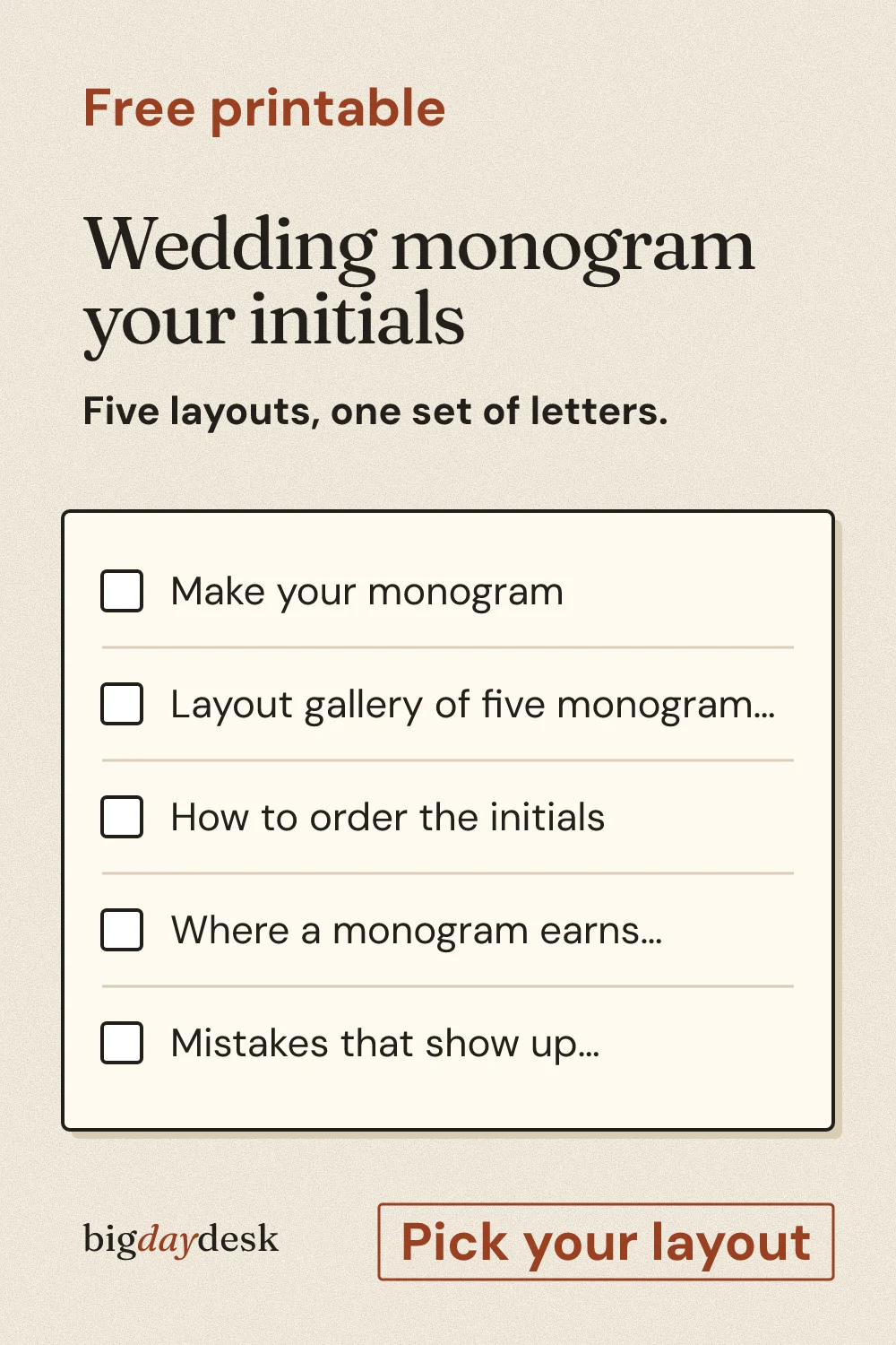
Save for later
Pin it now and find it when you are ready to plan.
Questions people ask
What is a wedding monogram?
A wedding monogram is a small design made from the couple's initials. Most have three letters: two first initials with the last-name initial in the center, set larger. Couples put it on invitations, signs, napkins and favors so the day looks like one matched set. Think of it as a simple logo for your wedding.
How do you order the initials in a monogram?
In the classic three-letter style, the last-name initial goes in the center and is larger. Etiquette sources split on which first initial goes left, and many call either order fine. Pick one rule, such as alphabetical by first name, and use it on every item. Consistency matters more than which rule you choose.
Where do couples use a wedding monogram?
Couples use it on the invitation, RSVP card and envelope flap, then on welcome and table signs, napkins, cups, favors, the cake and a dance floor decal. It also works on a wedding website and thank-you cards. Repeating the same mark across these items is what makes it feel like a design.
What if we have different last names?
Skip the center letter. A single center initial would pick one name over the other. Use the ampersand layout, which shows both first initials joined by an ampersand with a last name underneath, or the banner layout. You can also set both last names on two lines under the initials.
Can I send the downloaded file to a printer?
Yes, with one caution. The SVG names the Fraunces font and falls back to Georgia if the computer opening it does not have Fraunces. For exact letters, use the Print card button, or ask your print shop to outline the text. Always get a digital proof and check the letters before approving a large order.
Sources
- allaboutplanners.com.au/monogram-etiquette (opens in a new tab) : Convention that the larger last-name initial sits in the center of a three-letter monogram, with first initials on either side.
- www.gifts.com/blog/monogram-etiquette (opens in a new tab) : Couple monogram order varies: some put the bride first initial on the left, others the groom, and either is called acceptable.
Updated by bigdaydesk editorial
Keep planning
-
wedding guest list template
Tiers guests into must-invite and maybe, applies a decline rate you choose, and outputs the headcount that feeds budget and seating.
-
Wedding hashtag ideas
Builds hashtags from the two names in six patterns and flags ones that read oddly when the words run together.
-
Bridal shower food: how much to make for your guest count
Quantity calculator by time of day (brunch, afternoon, evening) using per-guest assumptions we state, not industry claims.
-
Total
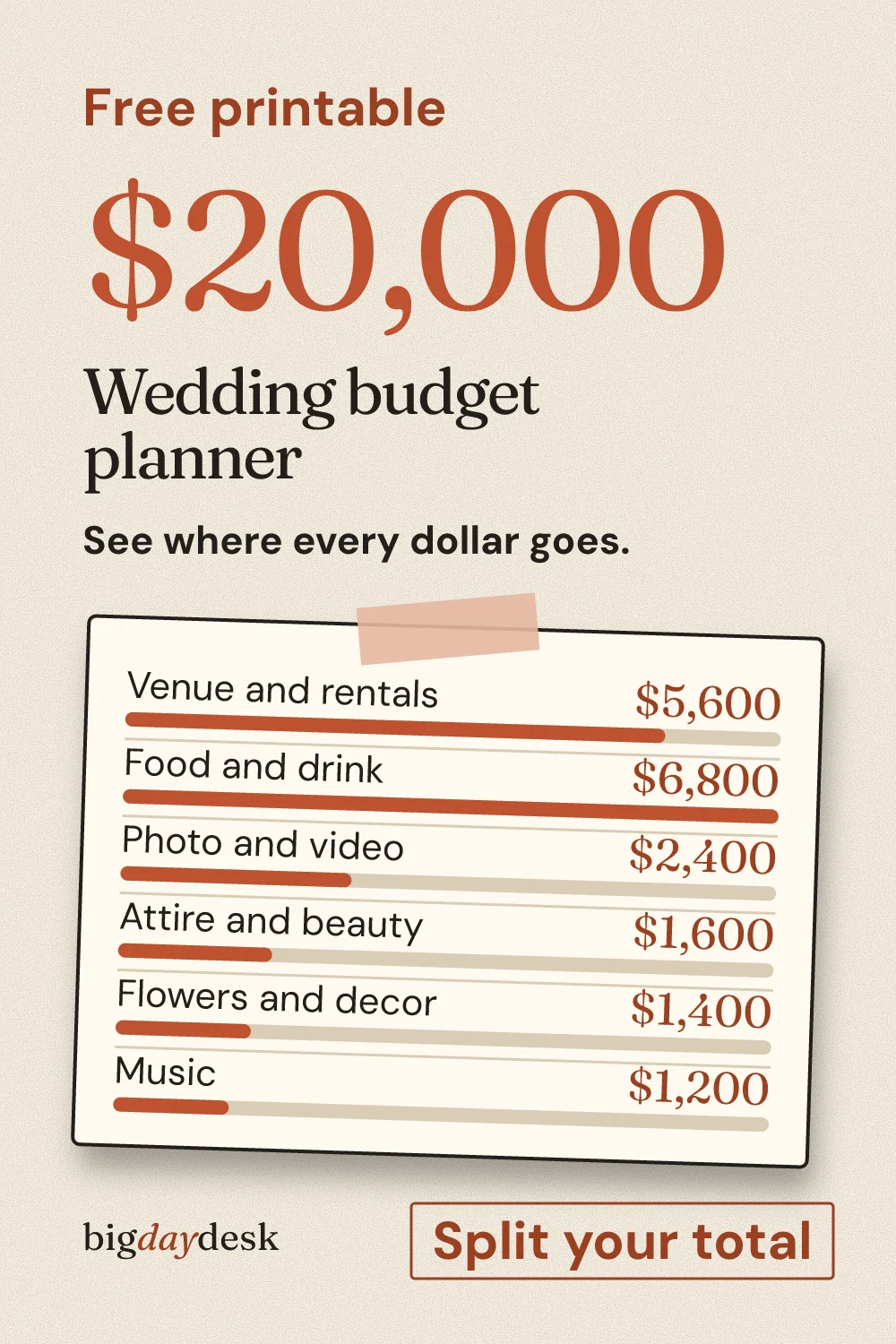
Total, guests and region in; category amounts out, with an adjustable cushion and a per-guest figure labeled as an estimate.